
Goodbye Salesforce. Hello custom CRM!
Sole UX/UI Designer to re-architect this company's CRM from the ground up. Admins can now update client accounts with 49% fewer clicks and 10 fewer screens per log- a faster, simpler system built for how they actually work.
*Due to confidentiality terms, the client name and specific identifiers have been omitted.
Client
Year
Roles
OUTCOME
Optimized data entry for admin unique needs
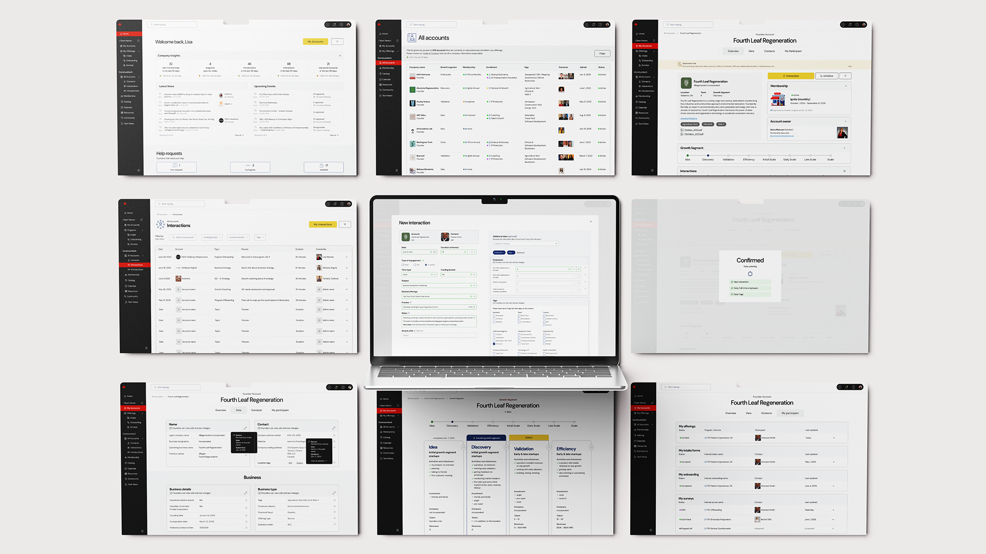
Rather than replicating Salesforce functionality into the company's internal portal, I re-architected the data-entry experience from the ground up to optimize both workflow and usability.
Key optimizations include:
- Centering the CRM around one unified data-entry point that auto-populates relevant fields across the account
- Redesigned account screens for clarity, hierarchy and speed
- Refined data sets to include what's relevant today while preserving legacy information
- Enabled self-service editing so admins and clients can update data directly
- Reinforced trust with contextual help, smart defaults and auto-save
Together, these updates drastically reduced task time by removing redundant screens and unessecary clicks.
.png)
.jpg)
.png)
.png)

PROBLEM
Too many clicks, too little buy-in
When this company's Salesforce became more of a burden than a usable tool, admin engagement plummeted. Logging data meant jumping between 24 Salesforce Objects, totaling to an average of 83 clicks for the most common task.
Admins described the process as a difficult and inconvenient chore. Understandably, data was inconsistent and data quality suffered.
I was brought in as the sole UX/UI Designer to re-architect the experience and restore confidence in a system used daily by approximately 100 internal staff supporting 1200+ tech startups.

RESEARCH
Usability testing: mismatch between software and user's mental models
I led a research sprint of usability testing, contextual inquiry and stakeholder interviews across departments (Client Services, Data & IT, Program teams & Executives). Admins needs, behaviours and contexts revealed design priorities.
Testing confirmed what admins had long voiced: the mental model behind Salesforce did not match their workflow. The admins interfacing with clients weren’t thinking in data and reports, they were thinking in relationships. Every client call sparked rich account updates and the system forced them to scatter that data across a possible 24 separate objects in the clients' account.
Admins needed a simplified way of editing and interpreting data.
.jpg)
SOLUTION
Making data entry effortless
Rather than replicating Salesforce functionality into the company's internal portal, I re-architected the data-entry experience from the ground up to optimize both workflow and usability.
Key optimizations include:
- Centering the CRM around one unified data-entry point that auto-populates relevant fields across the account
- Redesigned account screens for clarity, hierarchy and speed
- Refined data sets to include what's relevant today while preserving legacy information
- Enabled self-service editing so admins and clients can update data directly
- Reinforced trust with contextual help, smart defaults and auto-save
Together, these updates drastically reduced task time by removing redundant screens and unessecary clicks.
IMPACT
Admins reclaim time, improved data quality and cut platform costs
Streamlining data entry was both a UX and an organizational win. Aligning the CRM with real admin workflows will help Communitech reclaim valuable time, data quality and eliminate reliance on licening costs - all while restoring trust in the system.
.png)
LEARNING
Iterative design drives lasting success
While I’m proud to have delivered this transformation as the sole designer in just three months, the project reinforced the value of iteration. Revisiting the work post-handoff surfaced new opportunities to further refine flow logic and UI hierarchy - reminding me that even strong solutions evolve through ongoing testing and feedback.
