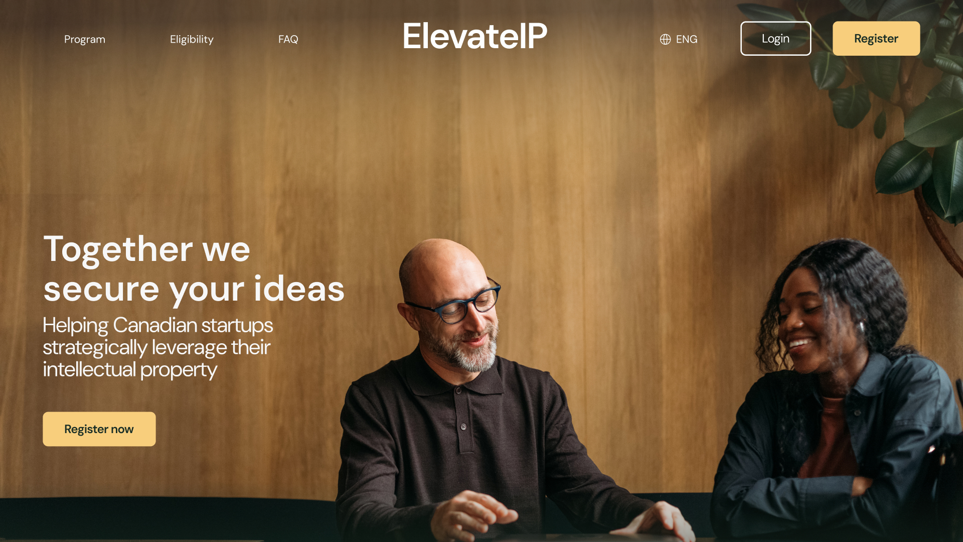
I was brought in as the sole UX/UI Designer to reimagine ElevateIP’s portal from the ground up.
Through a complete UX/UI overhaul, I turned a frustrating, bare-bones experience into an intuitive tool that enables clients to apply for and access IP services with ease. I also redesigned the admin-facing portal and CRM for program management.
The new system reduced support requests by 31% and cut intake form completion time by an average of 26 minutes.
Client
Year
Roles
OUTCOME
Streamlining service with a robust portal
While the entire portal required a refresh, the most significant usability gains came from redesigning the intake form. Reworking both the UX and UI created a faster, clearer application experience without removing any required data inputs.
Key improvements included:
- Welcoming introduction screen to set expectations and reduce friction
- Fully re-architected user flow and screen layouts for clarity and momentum
- Chunking the long form into digestible, motivational sections
- Non-linear stepper wiht prograssive validation, allowing users to jump freely between sectiosn without losing progress
- Refined visual hierarchy, purposeful color use and improved branding alignement
- Contextual help through inline tooltips and field-level guidance
- Smart defaults to pre-fill known data and reduce manual entry
- Inline validation for instant feedback and error prevention
PROBLEM
Barebones portal creates more friction
ElevateIP's client-facing portal was originally built without design input, resulting in a barebones and confusing user experience. Clients described the portal - particularly the intake form - as 'confusing', 'difficult' and 'cumbersome'.
Critical usability issues compounded frustration:
- Poor wayfinding
- Confusing navigation
- Hidden buttons
- Counterintuitive UX
- No inline validation or contextual guidance
- Incorrect form fields types
- Inconsistent error states
Internal staff across 3 delivery teams were overhwlemed by help requests and manual fixes. As one admin put it:
"We shouldn't need an FAQ to explain how to edit or submit the intake form."
RESEARCH
The portal was failing the user
I led a comprehensive UX research project that included 12 stakeholder interviews, 6 usability tests, competitive benchmarking & full design review.
The end-users were busy startup founders with limited time, high cognitive load and little patience for friction.
Research revealed a clear truth: the portal as a whole was lacking key usability elements. Users were not failing to use the portal - the portal was failing them.
SOLUTION
Better intake, happier applicants
While the entire portal required a refresh, the most significant usability gains came from redesigning the intake form. Reworking both the UX and UI created a faster, clearer application experience without removing any required data inputs.
Key improvements included:
- Welcoming introduction screen to set expectations and reduce friction
- Fully re-architected user flow and screen layouts for clarity and momentum
- Chunking the long form into digestible, motivational sections
- Non-linear stepper wiht prograssive validation, allowing users to jump freely between sectiosn without losing progress
- Refined visual hierarchy, purposeful color use and improved branding alignement
- Contextual help through inline tooltips and field-level guidance
- Smart defaults to pre-fill known data and reduce manual entry
- Inline validation for instant feedback and error prevention
IMPACT
Faster intake, fewer support tickets
The ecosystem has shown measurable improvements across usability and efficiency metrics. Founders completed applications faster, with fewer errors and less frustration, while admins saw a dramatic drop in support requests
- 26 minutes saved per form, on average
- 36% fewer support tickets related to portal issues
- Noticeably improved user trust
During validation interviews, clients described the new portal as 'simple', 'straightforward' and 'a relief'. One previous applicant summarized the sentiment perfectly:
"I wish this had been the portal I could have signed up with when I went through this."

LEARNING
Best practices have big impact
This project validated how seemingly simple UX refinements can create outsized impact at scale. Applying fundamental best practices - such as clear hierarchy, visible controls and contextual validation - improved usability far more than adding new features or visual complexity.
Moving forward, I plan to incorporate System Usability Scale (SUS) scores and deeper metric analysis to more rigorously quantify usability improvements and strengthen the business case for UX-driven design decisions.


.jpg)


.jpg)
.jpg)

.png)
.png)
.jpg)